
IHOOW
Project Overview
I am undertaking the design of the logo for IHOOW, a company dedicated to providing integrated digital solutions that drive transformation and efficiency for businesses. The objective of this project is to create a visual identity that effectively communicates the brand’s values of innovation, modernity, and technological excellence. The logo must not only be aesthetically compelling but also serve as a memorable and scalable representation of IHOOW’s commitment to intelligent digital ecosystems. To achieve this, I will carefully analyse the brand's positioning, conceptual direction, typography and colour psychology.
Client: IHOOW Solutions
Designer: Killian Pham
Scope Of Work: Brand Concept
Year: 2021
Objectives
In IHOOW represents the seamless integration of digital solutions, enabling businesses to optimise their processes through cutting edge technology. The symbolism behind the logo must align with the core philosophy of digital ecosystems that evolve and adapt. The existing design elements already integrate minimalism and a technical aesthetic, which I must refine and build upon. The "</>" coding symbol, widely recognised as a representation of programming and software development, offers a strong conceptual foundation, emphasising IHOOW’s expertise in digital infrastructure.

Automation
Digital Technology
Ecosystem Integration
Intelligent Solutions


Typography & Lettering
Typography plays a crucial role in defining IHOOW’s brand voice. A sans-serif typeface with clean, structured lines is essential to convey clarity, modernity, and professionalism. The type should reflect technological sophistication while ensuring readability across different applications.
The spacing and proportions need to be carefully calibrated to maintain harmonious alignment and visual balance, ensuring the typography remains legible and distinctive, even in compact or monochrome variations.

Colour Palette & Visual Harmony
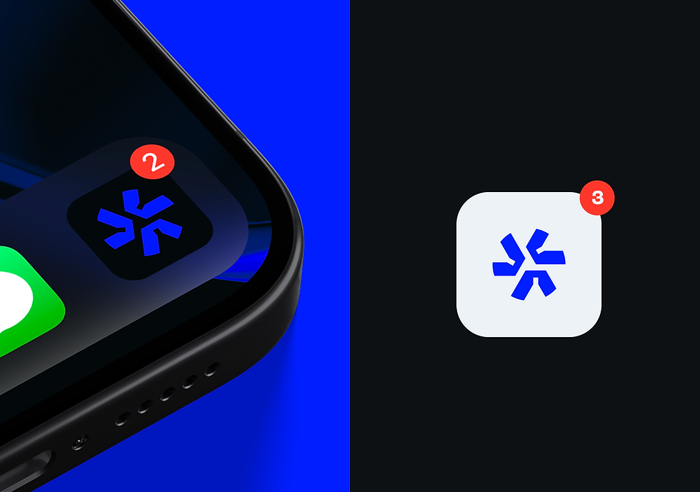
The choice of colours in IHOOW’s branding will significantly impact how the logo is perceived. A vivid blue and black palette is a strategic decision, symbolising technological prowess, reliability, and modernity. Blue, widely associated with intelligence and trust, reinforces the brand’s credibility in the digital sector.
The gradient effect or layered tonal contrasts could further add depth and dimensionality, making the logo more dynamic and adaptable to digital interfaces. I will ensure that the logo maintains strong visibility and impact across different backgrounds and media formats

Symbolic Impact
Designing the IHOOW logo is an opportunity to capture the essence of digital transformation through a striking and future forward visual identity. By carefully balancing symbolism, typography, and colour psychology, I crafted a logo that not only aligns with IHOOW’s mission but also strengthens its presence in the competitive landscape of digital solutions and technological innovation.
The end goal is to create a versatile, memorable, and impactful brand identity that communicates IHOOW’s commitment to excellence and continuous evolution in the digital world.


